Brian said that he really liked how I had gone about combining digital and traditional practices in a way that suited me, rather than by following an way someone else had done before me. He said this really made the processes in my work my own.
I appreciate that this has been picked up on by Brian as coming to find a happy medium between my digital and traditional techniques was a core focus of the research in my project.
David said that my rendering ability had improved throughout the project and I am glad this is the case. Earlier in the project I got feedback from David saying that his preference was my pencil work so, referring to Brian's feedback, I'm glad I was able to combine the feel of my traditional drawings into my final outcome. Doing this created a style of drawing unique to me.
Wednesday, 20 April 2016
Sunday, 10 April 2016
Where from here?/Evaluation
My vision statement for this project, was to "Improve my rendering techniques and develop my own visual style in order to begin practicing as a freelance Illustrator", and I feel over the course of this semester I have met the aim of my project.
This was my illustrative ability prior to the start of this project:

And these final images from this semester show how my rendering techniques have improved throughout the semester.

I feel my ability to create images has really improved. My knowledge of composition has expanded due to my reseach in this module has expanded, as well as my knowledge of tchniques, due to my research into the workings of other artists.
Through creating my own set of brushes I have also been able to personalize my own artwork and really create my own signature style through the use of my brushes. My ability to create my own brushes has helped combine my digital and traditional work, and the knowledge of how to create my own brushes opens avenues in the future for me to define by visual style further.
My research into marketing myself has really helped my progress further into setting up my own business online and my use of social media has helped me begin building a client base onlline. The combination of my social media and the way I presented myself at the convention has already started to build me a client base (see messages I have begun to receive below.)

I have even received my first comission request which begins my journey into paid illustration work, which was the aim of this module.
The commission I am currently working on is seen below ( it is the clients own character).


I am really enjoying where this project has taken me and I'm having a lot of fun drawing this original character.
Obviously my research into art/the art industry doesn't stop after the completion of this project and completing this project has lead onto greater things.
After the completion of this project, my goals are to continue working on expanding my client base. I would like to continue creating paid commission work but also continue expanding my own base of work. Now I have significantly improved my rendering skills and started working as a freelance illustrator due to the research/progress I have made in this project. I would like to progress further by creating more original work and original characters to expand my portfolio online. I would also like to focus on drawing more complex images from this point on, incorporating full bodies of characters and beginning to include environment work as seen in the commission process above.
This was my illustrative ability prior to the start of this project:

And these final images from this semester show how my rendering techniques have improved throughout the semester.
I feel my ability to create images has really improved. My knowledge of composition has expanded due to my reseach in this module has expanded, as well as my knowledge of tchniques, due to my research into the workings of other artists.
Through creating my own set of brushes I have also been able to personalize my own artwork and really create my own signature style through the use of my brushes. My ability to create my own brushes has helped combine my digital and traditional work, and the knowledge of how to create my own brushes opens avenues in the future for me to define by visual style further.
My research into marketing myself has really helped my progress further into setting up my own business online and my use of social media has helped me begin building a client base onlline. The combination of my social media and the way I presented myself at the convention has already started to build me a client base (see messages I have begun to receive below.)

I have even received my first comission request which begins my journey into paid illustration work, which was the aim of this module.
The commission I am currently working on is seen below ( it is the clients own character).


I am really enjoying where this project has taken me and I'm having a lot of fun drawing this original character.
Obviously my research into art/the art industry doesn't stop after the completion of this project and completing this project has lead onto greater things.
After the completion of this project, my goals are to continue working on expanding my client base. I would like to continue creating paid commission work but also continue expanding my own base of work. Now I have significantly improved my rendering skills and started working as a freelance illustrator due to the research/progress I have made in this project. I would like to progress further by creating more original work and original characters to expand my portfolio online. I would also like to focus on drawing more complex images from this point on, incorporating full bodies of characters and beginning to include environment work as seen in the commission process above.

Post Con Analysis
I think I did really well at the convention. I'm really happy with the amount of prints I sold.
The most popular by far was my frank print, which was surprising. I did do very well on social media so the success did correlate but even so, I was surprised that at an anime convention it sold so well because the smaller, selective audience (anime loving teenagers) weren't who I thought would buy the print.
The Princess Mononoke print did the second best. This again surprised me because I thought it would sell more than the Frank being that it's a Ghibli print at the anime convention.
All the rest of my prints sold more or less the same amount except for the Frozen print and the Harley print which I didn't sell any of. I sold quite a few of all the others so this was odd.
The prints did garner a lot of interest but none of them sold. I think this is because the audience that was looking at those prints was a lot younger (14 ish) I think the price point of £15 may have been too high for that audience as they don't have that much to spend, hence the prints not selling.
All my research pointed me towards selling the Harley print in a deal with the ivy print, but I backed out of this last minute because of positioning, but also because I was afraid of underselling my work. I feel because of this, I didn't sell any so I should have listened to what my research told me. This was a good learning experience though and a wake up call for me to really pay attention to market research. This knowledge will help me when I am designing my own business (hopefully) in the future.
This is really good market research though. When I go into freelance illustration as I would like to, I need to make sure my price points are relatable to the target market I'm aiming at so my work sells. I didn't really think about this before the convention so I've learnt something there. I was only thinking that I myself, would prefer to buy A3 art prints and wasn't thinking about what my target audience would be able to afford. I don't plan to lower the price of my A3 prints because I think doing so would be devaluing myself. I think instead I need to print out smaller sizes which I can price lower and make more affordable to my target audience.
I do also wish I'd kept Ivy and Harley together and done the offer as I think more would have sold. This is something to keep in mind for next time though.
The most popular by far was my frank print, which was surprising. I did do very well on social media so the success did correlate but even so, I was surprised that at an anime convention it sold so well because the smaller, selective audience (anime loving teenagers) weren't who I thought would buy the print.
The Princess Mononoke print did the second best. This again surprised me because I thought it would sell more than the Frank being that it's a Ghibli print at the anime convention.
All the rest of my prints sold more or less the same amount except for the Frozen print and the Harley print which I didn't sell any of. I sold quite a few of all the others so this was odd.
The prints did garner a lot of interest but none of them sold. I think this is because the audience that was looking at those prints was a lot younger (14 ish) I think the price point of £15 may have been too high for that audience as they don't have that much to spend, hence the prints not selling.
All my research pointed me towards selling the Harley print in a deal with the ivy print, but I backed out of this last minute because of positioning, but also because I was afraid of underselling my work. I feel because of this, I didn't sell any so I should have listened to what my research told me. This was a good learning experience though and a wake up call for me to really pay attention to market research. This knowledge will help me when I am designing my own business (hopefully) in the future.
This is really good market research though. When I go into freelance illustration as I would like to, I need to make sure my price points are relatable to the target market I'm aiming at so my work sells. I didn't really think about this before the convention so I've learnt something there. I was only thinking that I myself, would prefer to buy A3 art prints and wasn't thinking about what my target audience would be able to afford. I don't plan to lower the price of my A3 prints because I think doing so would be devaluing myself. I think instead I need to print out smaller sizes which I can price lower and make more affordable to my target audience.
I do also wish I'd kept Ivy and Harley together and done the offer as I think more would have sold. This is something to keep in mind for next time though.
Convention day set up

I think all my practice and research really paid off.
The overhead stand really made our stall stand out against the other tables and more importantly, gave me enough room to display my work as it would not all have been visible on a half table.
Thankfully duct taping the stand to the table did work really well without mishap and everything seemed very stable.
I ended up not putting Harley and Ivy prints together as I'd planned. This is because when I saw the set up, I wanted to move my Mononoke down to the table so it would be at eye level with the people as they were walking round. As Frank had a lot of likes online I also wanted to keep him at eye level, the same with Frozen as it is such a popular film. I wanted to keep Rey, Mulan and Dany up top as they were the most colourful prints (by having those up top I hoped they'd be eye-catching and draw people over to the table.) This left Harley and Ivy split up unfortunately by dint of everything else. I also didn't put an offer on the two of them together because of the fact it would be hard to put on two prints that were no where near each other. I was also worried about underselling my work by having an offer and letting the prints go for cheap. As this would be my first ever convention, I wanted to see how things would sell and then adjust prices for my next con based on the results of this one.
Goodie bags | more marketing
As I don't have any small prints or very many offers on my prints I thought, based on my research, that creating a set of goodie bags might be a good marketing ploy as an incentive for people to purchase one of my prints.
In the bags I included some sweets and a business card so anyone who purchases my work will be able to see where they got it from and look me up online.
The goodie bags I made:

In the bags I included some sweets and a business card so anyone who purchases my work will be able to see where they got it from and look me up online.
The goodie bags I made:
Friday, 1 April 2016
Colouring books
To create more variety in the products I'm selling at my stall, I decided to create some colouring books. These are very popular at the moment so I'd like to see how they do at the convention. If they sell well this could give me another string to my bow and something else I could sell as a freelancer that would set me apart from other freelance artists.
This will also allow me to produce some lineart of my work (to allow it to be coloured in). Lineart (digital lineart) is something I usually avoid as my style of drawing is very sketchy and scruffy. Doing this lineart will allow me to improve my rendering techniques by trying a new style of drawing that is very new to me.
Before I started creating my own colouring book line art, I decided to look at some line art in existing colouring books.


These colouring books for adults have patterns that feature a variety of shapes, and sizes to colour.
they also feature full page designs and ones that are surrounded by a white area.
 Above are my designs for my colouring book.
I decided to have varying shapes and expanses of white to colour in on the different pages to ass a bit of variety.
To get the lineart neat, I traced over my original drawings in their full, A3 size and them shrunk them down to A5 (the size of the colouring book). This way the lines are a lot neater as youre not seeing them full size.
Because the colouring books needed a cover, I just re appropriated the image I created for my business card.
 For my first attempt at creating a cover I used a white border effect that bled into the lines separating the images.
I created white text that also bled into the border. I underlined this with black text that displayed my name.
I didn't like this version. I decided to make a cover that had all the images on it available inside the book so the client could see on the front what they would get to colour in. I also didn't think the text looked very good placement wise. I also used arial as a font in this mock up and decided instead I wanted to keep the font on the cover of the book the same as the font on my business card. This keeps my brand image consistent.
 This is my re-try at creating the cover. I learnt a lot from my first attempt. All the drawing included are now on the front cover and the font is consistent with he font on my business card, including the fact that the text is comprised on images. To make the text stand out, I used a semi-transparent back drop and a drop shadow effect on the text to make it look more dynamic.

I kept the back the same as the back on my business card for consistency.
After finishing the books. These were the printing preferences I chose:

I chose 300gsm for the paper weight so the book would look thicker and also so if someone coloured in the book using felt tip the colour wouldn't bleed through the page onto the image behind.
I also chose one sided pages to give the book more of a luxury feel.
I used un-coated paper to make sure the pages had a matte finish that would be easy to colour on.
I chose wiro bound so the books would be easier to colour on/in.
When the prints arrived however there was a problem, they had been printed on gloss (the company's mistake). See below for images:
 Because of this I had to contact the printing company and request a reprint of my books as they were not suitable for purpose as they were.
Luckily, the company agreed to a free reprint and sent me out some replacements.

I'm really happy with how the final prints turned out.
Even the printing mistake made me deal with contacting the print service. This is something I will probably come up against as a freelancer and it's good to know I can deal with printing mistakes now, it's a good sign for the future.
Eventually, I would make a plan to get my own printer so I can produce prints by myself. But affording an a3 printer and ink for a printer is out of my price range at this stage of my career. Because of this, it's good to know I have the confidence and ability to communicate and negotiate with other business' online.
This will also allow me to produce some lineart of my work (to allow it to be coloured in). Lineart (digital lineart) is something I usually avoid as my style of drawing is very sketchy and scruffy. Doing this lineart will allow me to improve my rendering techniques by trying a new style of drawing that is very new to me.
Before I started creating my own colouring book line art, I decided to look at some line art in existing colouring books.
These colouring books for adults have patterns that feature a variety of shapes, and sizes to colour.
they also feature full page designs and ones that are surrounded by a white area.

I decided to have varying shapes and expanses of white to colour in on the different pages to ass a bit of variety.
To get the lineart neat, I traced over my original drawings in their full, A3 size and them shrunk them down to A5 (the size of the colouring book). This way the lines are a lot neater as youre not seeing them full size.
Because the colouring books needed a cover, I just re appropriated the image I created for my business card.

I created white text that also bled into the border. I underlined this with black text that displayed my name.
I didn't like this version. I decided to make a cover that had all the images on it available inside the book so the client could see on the front what they would get to colour in. I also didn't think the text looked very good placement wise. I also used arial as a font in this mock up and decided instead I wanted to keep the font on the cover of the book the same as the font on my business card. This keeps my brand image consistent.


I kept the back the same as the back on my business card for consistency.
After finishing the books. These were the printing preferences I chose:

I chose 300gsm for the paper weight so the book would look thicker and also so if someone coloured in the book using felt tip the colour wouldn't bleed through the page onto the image behind.
I also chose one sided pages to give the book more of a luxury feel.
I used un-coated paper to make sure the pages had a matte finish that would be easy to colour on.
I chose wiro bound so the books would be easier to colour on/in.
When the prints arrived however there was a problem, they had been printed on gloss (the company's mistake). See below for images:
 Because of this I had to contact the printing company and request a reprint of my books as they were not suitable for purpose as they were.
Luckily, the company agreed to a free reprint and sent me out some replacements.
I'm really happy with how the final prints turned out.
Even the printing mistake made me deal with contacting the print service. This is something I will probably come up against as a freelancer and it's good to know I can deal with printing mistakes now, it's a good sign for the future.
Eventually, I would make a plan to get my own printer so I can produce prints by myself. But affording an a3 printer and ink for a printer is out of my price range at this stage of my career. Because of this, it's good to know I have the confidence and ability to communicate and negotiate with other business' online.
Sunday, 27 March 2016
Printing Results!
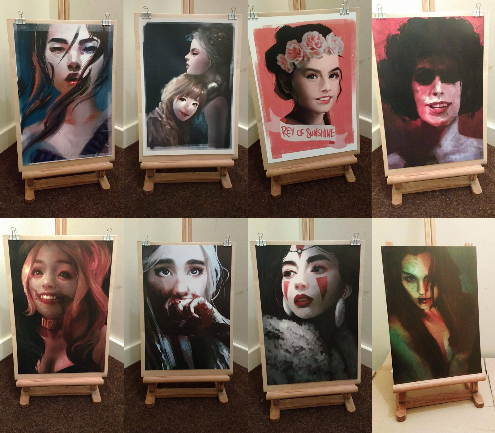
I was really happy with the quality of the prints and how they turned out. They all printed out a little darker than they looked online which was a little disappointing. It wasn't that obvious though. I did convert my prints to CMYK before printing but I didn't paint the images in this setting because my version of Photoshop errors when I try to do that for some reason. I wonder if this is why. If not (because I did res-ave them as CMYK before printing) maybe a higher quality paper would have brought out the colours better. This is something to think about for next time I get my work printed off.
It's really nice also, to see all the work I have done this semester collectively and physically. I feel my ability to render images has really improved over the course of this module and I feel having 8 completed images for the end of the semester is a great achievement.
Tuesday, 22 March 2016
Printing
To print my images I chose 170gsm poster paper with no lamination. Based on what I looked up, anything (paper-wise) heavier than 170gsm is usually classed as board, so I wanted to get the heaviest weight paper I could so my prints looked a god quality, without my posters becoming too thick.
I used indoor poster paper that was available through the printing website, just because, for my first convention, I couldn't afford a more expensive paper type for the amount I was printing.
I didn't get a gloss laminate on my prints because it would have added to my costs and I also didn't think I would need one for a poster.

I used indoor poster paper that was available through the printing website, just because, for my first convention, I couldn't afford a more expensive paper type for the amount I was printing.
I didn't get a gloss laminate on my prints because it would have added to my costs and I also didn't think I would need one for a poster.

Sunday, 20 March 2016
Displaying art at artists alley

I looked at lots of references at how other artists displayed their tables but decided the most achievable for me at this convention was this method I created.
The plan for the table is on the bottom right.
Most convention tables using poles were made using pvc piping (which i couldn't find anywhere) so instead of that, I bought a clothes rail from Argos, and then a 6ft long pole from a DIY store so the pole would stretch across the whole table.
I also used bull clips tied onto the 6ft pole with ribbon and then attached card to them to back my prints.
To create prints hanging in a row, I used a scalpel to poke small holes in the card and then used thin wire to attach the card pieces together.
I also duct taped this to the floor and the back of the table. Most blogs suggested using table clamps to attach the poles but they were too expensive for me for a single convention, so I created this variation instead.
Aside from the method I used, two other methods seemed pretty common,

The wire cubes seemed a really good idea, but as all my prints were flat there was really no need for the shelving this could provide. Wire cubes were also very expensive and the pole method was much more cost effective.
I thought the pole version of displaying was better than the minimalist version because this way my art would be able to be seen from a distance whereas it wouldn't be if I used the minimalist set up.
***
Not all of my art would fit on an overhead display and so I had to come up with a way to stand my art up on the trestle table. My original decision was to use frames but this idea proved to be very expensive and I worried that people thought I might be selling framed prints if I advertised them this way.
To combat this I created these L shaped stands you can see in my photos above.
Because my table cloth was white, I tried Papier Mâchéing the stands to make them a bit stiffer and then after that I painted them white. Rather than making the stands stronger though, the extra weight of the Papier Mâché really weighed the stands down and altered the shape, so I didn't use this idea.
Instead, I kept the stands using the plain card and just hot glued the bent edges to keep the folds at the right angles.
I added the backed prints to these stands to create an A shape. I hot glued the top of the stands to the back of the prints for stability.
Thursday, 17 March 2016
Artist alley tips and tricks from other artists
To continue developing my own visual style, I want to focus more on branding and how my stall will look on the day. As my stall will be a reflection of myself and my work. It is important to remember this going into freelance practice as your image and brand are what people will see when approaching you in person or online, it will be their first impression and could be the decider on whether they give you business or not.
Reading material:
https://www.qualitylogoproducts.com/blog/artist-alley-booths-starving-out-of-artist/
http://jojostory.net/post/110452410527/how-to-prepare-for-your-first-artist-alley
http://www.animeboston.com/artists/artists_alley_beginner_guide/
http://howtobeaconartist.tumblr.com/
I looked at a lots of blogs/posts from people who had done artists alley before as an idea of what to expect. Here is a summary of what I learnt.
Reading material:
https://www.qualitylogoproducts.com/blog/artist-alley-booths-starving-out-of-artist/
http://jojostory.net/post/110452410527/how-to-prepare-for-your-first-artist-alley
http://www.animeboston.com/artists/artists_alley_beginner_guide/
http://howtobeaconartist.tumblr.com/
I looked at a lots of blogs/posts from people who had done artists alley before as an idea of what to expect. Here is a summary of what I learnt.
- label prices prominantly but be aware people still probably wont read them (so some people don't enter a zone of awkwardness/afraid to ask you and just walk away)
- offer freebies, label them too, people might be shy otherwise.
- Engage passersby
- know your audience (who will be at the con, what are they in the market for?)
- Create a series for upselling
(I have considered doing this with my ivy/Harley images as dicussed earlier in my blog)
- printing costs and con costs should factor into pricing
- don't undersell your work ( can harm you and other artists and the industry)
- take an emergency kit (tape, scissors ect)
- Take business cards
(I have already discussed my doing this earlier in the blog)
- only offer comissions if you have time
I don't want to offer comissions on the day because my work on show is dgital and bringing a whole computer set up into a convention would just be difficult. My business card does state I am open for comissions however.
- be clear/make it clear what you specialise in
- display your art vertically, don't just lie it down on the table (people may not be able to get to your table to see it and so might miss your stall.) Have something they can see to draw them in.
Tuesday, 15 March 2016
All Round Service
Just a little update. When I've been to Deecon before, to artists alley, I've found people always sold prints with no packaging. This is really bad practice because in a busy convention, there's no way anyone's gonna get any prints home without them getting creased if they have no where flat to put them.
This only defines my visual style in a small way, but I've decided to bulk order lots of cardboard backed envelopes so if someone buys a print from my stall they can take it home flat.
Not only will this hopefully benefit my clients, it could also be a good visual identifier of my stall if people are walking around with large envelopes.
Questions like, "oh, where did you get that from?" could occur pointing more people to my table.
I think it's good when starting a brand to create a good reputation for quality and this will help me do that. Keeping my prints flat and secure is important to me and I'm assuming important to my client also, especially if they're paying say, £15 for this print. Packaging my prints is a luxury and hopefully adds to the experience of buying from my "brand".
This only defines my visual style in a small way, but I've decided to bulk order lots of cardboard backed envelopes so if someone buys a print from my stall they can take it home flat.
Not only will this hopefully benefit my clients, it could also be a good visual identifier of my stall if people are walking around with large envelopes.
Questions like, "oh, where did you get that from?" could occur pointing more people to my table.
I think it's good when starting a brand to create a good reputation for quality and this will help me do that. Keeping my prints flat and secure is important to me and I'm assuming important to my client also, especially if they're paying say, £15 for this print. Packaging my prints is a luxury and hopefully adds to the experience of buying from my "brand".
Thursday, 10 March 2016
Business Cards
After looking at marketing myself using my online social media, I decided to look at a more physical way of doing that. Creating some business cards will allow me to improve my rendering techniques and visual style as I will have to go through the process of designing the cards, including type which is something I don't really work with usually.
It will also help me with beginning to practice as a freelance illustrator as it is another way to display my "Brand" visually and have a form of advertising so people can find my artwork online.
Lots of artists have business cards as they are a good way to showcase your art to clients. Especially if you happen to meet someone out of the blue that could have an interest in your work, its an easy way to show them what you are all about.
At Deecon especially, having a business card on my stall will be an asset. They are something free for anyone to take and could be a way of drumming up freelance clients. People tat buy from me on the day can use those cards to find me online and people that perhaps didn't have the means to buy on the day can contact me for a sale/follow my work online. Business cards are a good way to drum up an audience. This will not only help build up my client base, but messages/requests from people who like my art could give me an indication of what my target audience is so I can produce work that is marketable to them.
To begin designing my own business card. I first looked at cards from other artists that I liked.

This card has a really bold, colour palette and the brush strokes make it look very expressive. You get a goo impression of the way the artists works from this card but not necessarily the sort of art they produce.
If I want to market myself as a freelancer, I want to have a card that has a better visual indicator of what clients should expect from me than this one has.

I really like this card. I like the colours in the font in the background. The front design also gives a good idea of the sort of art style the client can expect. I feel the style of text really suits the design aesthetic but like the last card, I think it's difficult to read.

I also really like this card, it's really illustrate and stylised. The use of a textured paper gives a really traditional feel. This isn't what I'm producing, traditional art, but I like the idea of the material giving an impression of the work an artist produces.
I like the really small stylised text but I don't feel it works very well as a form of advertising. If you want someone to contact you, make the ways they can do that obvious, don't try and hide it.

This is the initial sort of, sketch, for a business card that I came up with.
The plan was to do it as a self portrait but the more I messed around with it the more I really didnt lke it.
I just didnt think it owuld be very appealing to people at a con because they wouldnt know who I am so why would they want my face on a card, and also, was worried it wasnt desplaying the sort of work I produced very well, or the veriety of rendering techniques I'd learnt in the module over the year to get to this point.


This is the second design I did, and the one I got printed. I decided to, instead of creating a new image for the front of the card, reuse the images I had created so far this year as the cover. I feel this works really well. It's visually interesting and shows a variety of examples of my work.
I took the idea for my typography from the third business card design. I liked the use of colour on the text and thought it would look really interesting if the text was made up of images of my art.
I used brown for the main text and green for the accent colour because green was the most stand out colour in my name and the brown was colour dropped from my ivy paintin gas I knew it would go with the green (same painting) and the plain brown colour provided a nice base colour that blended with the imagery on my card.
The font I decided to go with was a sans serif because the absence of flourishes makes the font easier to read. I also laid out my type in a box to mirror the boxy font I used as well as the rectangular layout of my art on the front of the card.
Choosing how my cards were printed was also a very important process. Expert rendering of the physical card was important because its an integral part of how my work is viewed and displayed.
Because I don't have a printer, I decided to go with an online printing service. I had to be very careful about the options I chose because it wouldn't be me controlling the printing process.
In the end I went with a heavy card stock 300gsm and a matte paper. I really like the matte finish because I feel that it just looks and feels much sleeker and durable than gloss would have done. That and this way the printed images are not overpowered by any shine on the card.
Mulan Painting
This post displays another of my painting processes and I have annotated important points that are things I have picked up on that helped me complete this painting and are things I am adopting regularly when I paint. These are the things helping me create my own visual style.


 The liquify tool is your best friend for altering/changing shapes quickly. You can paint over this again later to give it a beter finish, but its good for getting multiple variations asap.


 I like adding contrasting colours as highlights rather than using, for example, a lighter blue on the hair. I don't wanna say that it makes the image 'pop', but it does.

 The Chinese writing made the painting look way too busy.

 I asked for feedback at this point as I felt the image looked unfinished but wasnt sure what I could do to finalise the look of it.
 Removed some of the sketchiness from the hair and made the characters fainter to make the image look less busy.
I like to make eyes slightly larger than is realistic but this is a personal preference. I think it makes my faces look a bit more expressive.


 The liquify tool is your best friend for altering/changing shapes quickly. You can paint over this again later to give it a beter finish, but its good for getting multiple variations asap.


Research into brands
I wanted to look into how brands "brand" themselves, how they advertise.
By looking at successful brands and how they are, I will better know how to market myself as a freelancer and what visual marketing techniques are viable and what works and why.

By looking at successful brands and how they are, I will better know how to market myself as a freelancer and what visual marketing techniques are viable and what works and why.
- Dominant colours used in logos are red, black and blue.
- Red is the colour of fire/blood so is associated with war/danger/strength/power/passion/love/desire.
- The colour red evokes strong emotions in a viewer as it is emotionally intense. The colour raises blood pressure, increases metabolism and respiration and so it is used to stimulate people into quick decisions.
- Black is associated with power, elegance, formality, death, evil and mystery. Gives sense of perspective and depth. It is mainly used to make other colours stand out.
- Blue is he colour of sky/sea. Often it is associated with depth and stability. It symbolises trust/loyalty/wisdom/confidence/intelligence/faith/truth.
- Blue is considered beneficial to mind/body. It slows metabolism and produces a calming effect. Associated with tranquility and calmness. Blue is often used to suggest precision when promoting high-tech products. Blue suppresses appetite so not usually used for promoting food.
- Overwhelmingly fonts are sans serif. Sans serif fonts are easy to read due to lack of flourishes and style. They are objective and clear.
- Flat design seems to be a preference over beveled, 3D designs.
- Dominant shapes in logos are squares, circles and rectangles.
Wednesday, 9 March 2016
Daenerys Painting and Poll


This is a painting I actually completed a while ago but after I finished it I was unsure if I actually liked it. It was siting in my art folder for a while and it was annoying me that I had a finished piece I wasn't using so I took to Facebook to ask other people what they thought of it.
The top image shows the sketch I started with whilst the last image shows the final result. I started out with a much warmer colour palette than I ended the painting with.
The scene is of Daenery's eating the heart in the firelight in S1 of Game of Thrones so I started with a warm, firelight kind of colour palette. As I kept painting though, I realised that the warm hues of the painting were giving the wrong impression. What looking at Ross Trans Art reminded me of was the importance of colour palettes and only keeping something if it aids your work. The warm palette was more accurate to the scene, but in my painting the warm oranges and reds used were more indicative of a warm country cottage fire and weren't really working. I didnt want the image to look threatening but I wanted it to look poignant and for the blood on her hand (the most important aspect in the scene) to stand out. Because of this I changed my palette to blues using the colour balance tool. Doing this made the red on the and really stand out and become a focal point in the image.
The stark blue/white in the image also reminds me a bit of hospital lights and I like the unsettling kind of feel created through the use of those colours.
The drawing is actually quite high contrast with dark reds/purples and bright blues. I think the eyes in the image really soften the contrast in the painting, giving the image a softer focus.
Using the "rule of thirds" technique of image layout, that I learnt about earlier in my research, I noticed that the colour use and soft eyes work really well.

The eyes fall into the top third of the grid whilst all the red is contained in the second third. The hair in the last third in the image is again, highlighted in blue. This defines the image creating really nice readability.
The reason I didn't like the image personally after finishing is that I thought it just looked a bit plain. I thought that it also wasn't very obvious who the drawing was of and that the brushstrokes were all very uniform and a bit boring. I don't feel like I committed fully to the more expressive brush strokes in the hand and hair so they weren't made use of very well.

These are the responses I got on facebook after asking for peoples opinions on this peice.
I got quite a lot of positive responses. One even supporting the use of colour and layout I talked about earlier.
Because of this I chose to add it to the selection of prints that I'm taking to Deecon.
Tuesday, 8 March 2016
Comparing Poll to Popularity of Prints on Social Media
On my social media, Mononoke and Frank are overwhelmingly the most popular.

I decided to do more "market research" by comparing the results of my Facebook poll to how my prints are doing views/likes wise online. The best form of social media to check this on was my Behance because it clearly displays these figures unlike other social media.
I found out:

I decided to do more "market research" by comparing the results of my Facebook poll to how my prints are doing views/likes wise online. The best form of social media to check this on was my Behance because it clearly displays these figures unlike other social media.
I found out:
- My Anna and Elsa drawing and my Harley have a lot of views but not a lot of likes and I'm not entirely sure why this is.
- In the poll I just took on Facebook, Poison Ivy came out ahead.
- No one has commented on the Harley (in the poll) which in addition to the fact it has a lot of views and not many likes on Behance worries me.
- I feel like when I sell these prints, maybe I should group it in an offer with the Ivy painting which is more popular. This would be a sales technique to make people more likely to buy it.
- The Frozen painting has a lot of views but not many likes on Behance, but it was liked in the poll I did on Facebook.
This sort of information allows me to know how I should present my stall on the day of the convention. It gives me a good indication of how I should present myself visually and how to style my brand/stall on the day.
Monday, 7 March 2016
Polling


As I have got so far in developing my visual style. I thought I would get some feedback to see how other people would respond to my imagery. As I aim to begin practicing as a freelance illustrator at the end of this module, i feel it is important to get feedback on my work in order to know peoples opinions about my style and content. This is good market research and doing research about your market is vital to freelance work as no one else will do it for you. It is only by doing this you know what your audience want and this is how you will make money,
Overall people really liked the idea of sets of paintings. I don't really have the time to paint full sets of character images right now, especially as doing so is not integral to the progression of this project but this is something to keep in mind for the future. Despite this, I can use this knowledge to say, group my DC paintings, Harley and Ivy, on the day of the con and maybe do an offer if you buy the two of them together.
This kind of insight is something I can only get from research and is something that will help me in presenting the visual/style layout of my table/brand at the con to help attract customers and clients.
Subscribe to:
Posts (Atom)
